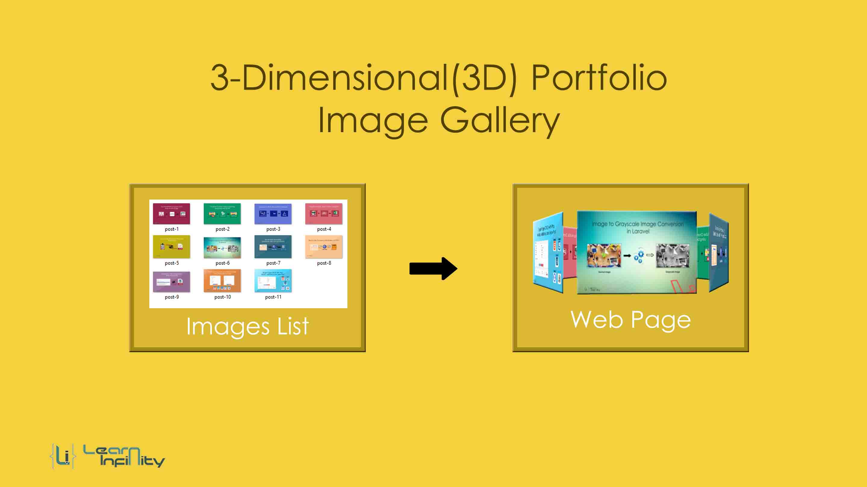
The Portfolio details is a very useful feature of the web page. You can establish your archived details and the works to the entire web community. It was outlined to bring in extra clients, get you selected based on this details.
Using this example we can also display selected images list as a gallery for user-friendly view pages. The 3D impression gives image gallery extended beautiful and produces a better UI view. In this post, we will learn how to make a 3-Dimensional(3D) image gallery with a help of CSS only on a web page.
In a real time, many of free or paid plugins are there to creating an image gallery. But this kind of plugins are may affect page loading speed and interrupt other running scripts.
Basic animation CSS details
Here transform property help us to set a position of each and every image in a portfolio gallery. we need to specify CSS for each and every image to get a 3D view.
|
1 2 3 4 5 6 7 8 9 10 11 12 13 14 15 16 17 |
animation: rotation 50s infinite linear; //Animation type init animation-play-state: paused; transform: rotateY(0deg) translateZ(350px); //transform key use to set the XY position for each and every layer and @keyframes rotation{ from{ transform: rotateY(0deg); } to{ transform: rotateY(-360deg); } } |
Step 1: HTML tag with image list details
Here we are going to define Basic tag container and images path information for 3D portfolio image gallery view.
|
1 2 3 4 5 6 7 8 9 10 11 12 13 14 15 |
<div class="my-3d-gallery"> <div id="my-3d-gallery-continer"> <div class="gallery-img"><img src="images/post-1.jpg" alt=""></div> <div class="gallery-img"><img src="images/post-2.jpg" alt=""></div> <div class="gallery-img"><img src="images/post-3.jpg" alt=""></div> <div class="gallery-img"><img src="images/post-4.jpg" alt=""></div> <div class="gallery-img"><img src="images/post-5.jpg" alt=""></div> <div class="gallery-img"><img src="images/post-6.jpg" alt=""></div> <div class="gallery-img"><img src="images/post-7.jpg" alt=""></div> <div class="gallery-img"><img src="images/post-8.jpg" alt=""></div> <div class="gallery-img"><img src="images/post-9.jpg" alt=""></div> <div class="gallery-img"><img src="images/post-10.jpg" alt=""></div> <div class="gallery-img"><img src="images/post-11.jpg" alt=""></div> </div> </div> |
Step 2: CSS Style
Here we are going to define the entire style for 3D portfolio image gallery view in a web page. Here we define image initial position and rotation animations with continuous loop interval.
|
1 2 3 4 5 6 7 8 9 10 11 12 13 14 15 16 17 18 19 20 21 22 23 24 25 26 27 28 29 30 31 32 33 34 35 36 37 38 39 40 41 42 43 44 45 46 47 48 49 50 51 52 53 54 55 56 57 58 59 60 61 |
<style> .my-3d-gallery{ position: relative; perspective: 1200px; margin: 5% auto; width: 350px; height: 350px; } #my-3d-gallery-continer{ position: absolute; width: 100%; height: 100%; animation: rotation 50s infinite linear; transform-style: preserve-3d; } #my-3d-gallery-continer:hover{ animation-play-state: paused; } #my-3d-gallery-continer .gallery-img{ position: absolute; display: block; left: 10px; top: 50px; width: 100%; height: 70%; overflow: hidden; border: solid 2px rgba(207, 207, 207, 0.5); background: transparent; } #my-3d-gallery-continer .gallery-img:nth-child(1) { transform: rotateY(0deg) translateZ(350px);} #my-3d-gallery-continer .gallery-img:nth-child(2) { transform: rotateY(60deg) translateZ(350px);} #my-3d-gallery-continer .gallery-img:nth-child(3) { transform: rotateY(120deg) translateZ(350px);} #my-3d-gallery-continer .gallery-img:nth-child(4) { transform: rotateY(180deg) translateZ(350px);} #my-3d-gallery-continer .gallery-img:nth-child(5) { transform: rotateY(240deg) translateZ(350px);} #my-3d-gallery-continer .gallery-img:nth-child(6) { transform: rotateY(300deg) translateZ(350px);} #my-3d-gallery-continer .gallery-img:nth-child(7) { transform: rotateY(360deg) translateZ(350px);} #my-3d-gallery-continer .gallery-img:nth-child(8) { transform: rotateY(420deg) translateZ(350px);} #my-3d-gallery-continer .gallery-img:nth-child(9) { transform: rotateY(480deg) translateZ(350px);} #my-3d-gallery-continer .gallery-img:nth-child(10) { transform: rotateY(540deg) translateZ(350px);} #my-3d-gallery-continer .gallery-img:nth-child(11) { transform: rotateY(600deg) translateZ(350px);} #my-3d-gallery-continer img{ cursor: pointer; transition: all .5s ease; width:100%; height:100%; } #my-3d-gallery-continer img:hover{ transform: scale(1.1,1.1); } @keyframes rotation{ from{ transform: rotateY(0deg); } to{ transform: rotateY(-360deg); } } </style> |
Download Demo


